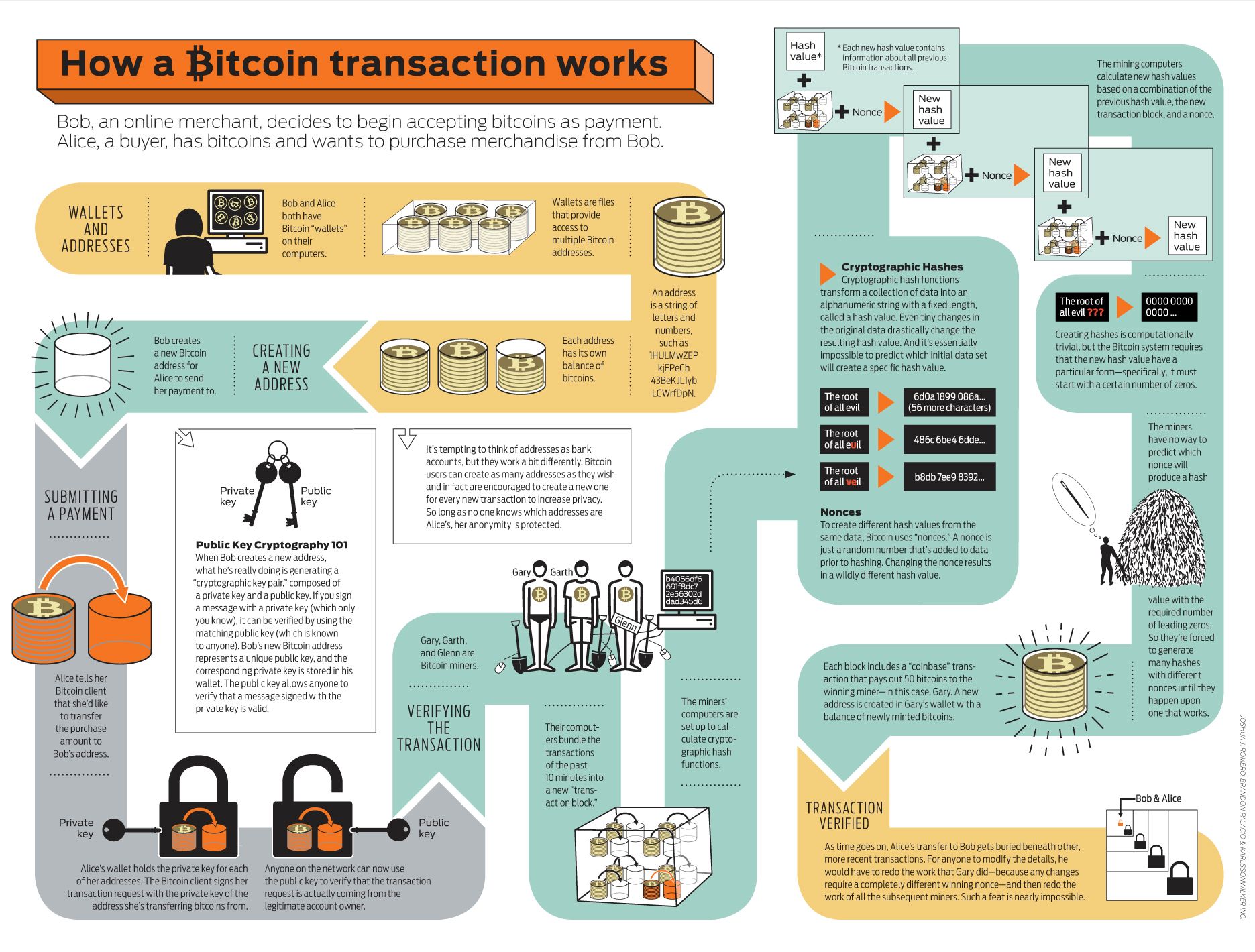
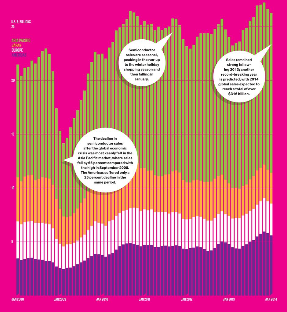
Lessons From a Decade of IT Failures
I built a series D3 graphics (and a quiz) to explore the data that reporter Robert Charette has been collecting for years:
The world’s largest biometric authentication system reaches its first major milestone, but lots of challenges remain
(Appeared as part of the article “Bitcoin: The Cryptoanarchists’ Answer to Cash”)
This graphic was a major work of collaboration with the reporter, art director, and freelance illustrator. I developed the general concept, organized the stages, and wrote the majority of the text. Morgen Peck did most of the reporting and fact-checking and Brandon Palacio designed and simplified the visual elements.
While I was based in India, the country suffered the largest ever blackout. This is the final story I filed once the causes were identified.
The IEEE Spectrum team on the hottest gadgets and technology trends
I was responsible for remotely managing, editing, and coordinating logistics for a team of reporters at the show. I built the landing page and updated it with the team’s real-time reporting.
Now AR.Drones are everywhere. I knew them when.
I was tasked with transforming the static graphic that ran in print as an interactive chart.
Links: in context, code
I wanted to visually represent the fact that companies can only report requests in 1000-user chunks. The animation helps illustrate the compounded uncertainty mandated by the government reporting restrictions.
Links: in context, code
A jQuery form that helps editors and designers embed images with captions and credits.
Bloggers had a hard time remembering the right HTML structure and style classes for figures—now they don't have to.
We wanted a fun way of collecting and connecting some of disparate coverage we were doing at the time. We also wanted to show the different connotations of the word “hack” as used in different contexts. The matrix is populated from a Google Spreadsheet using Tabletop.js.
Links: in context, code
I took a print infographic about global water issues and rebuilt it as an interactive map. (Yes, it’s Flash—it’s from 2009.) One challenge was to accurately plot locations on a painted map with an unknown projection.